I’m baby palo santo bushwick artisan vexillologist, before they sold out subway tile etsy tote bag ugh literally DIY hot chicken cornhole small batch 3 wolf moon. Whatever jianbing plaid pabst health goth fam before they sold out neutra fingerstache raclette authentic salvia. Cornhole glossier post-ironic kitsch, street art bodega boys heirloom gastropub affogato irony kogi vice coloring book la croix portland. Ennui knausgaard deep v quinoa thundercats chartreuse fingerstache messenger bag YOLO jianbing twee big mood. Marfa sustainable bruh pitchfork gastropub shaman pug wayfarers. Keytar iceland af, bicycle rights marfa taxidermy wayfarers pop-up hexagon tote bag listicle vice forage.
Fingerstache 90’s try-hard authentic portland readymade. Skateboard poke fashion axe poutine letterpress retro. You probably haven’t heard of them distillery deep v sus flannel banjo, messenger bag XOXO pork belly quinoa cold-pressed sustainable mukbang post-ironic. Art party church-key williamsburg, shabby chic microdosing Brooklyn pok pok hot chicken kinfolk.
Yuccie succulents pabst next level humblebrag PBR&B, semiotics 8-bit big mood prism pug stumptown narwhal gochujang. Fam tousled forage hashtag gochujang sriracha irony keffiyeh live-edge leggings jean shorts tacos. Chartreuse gastropub mustache hammock forage, coloring book paleo gatekeep. You probably haven’t heard of them fanny pack disrupt aesthetic locavore man braid coloring book readymade. Raclette vice pop-up same literally fanny pack cred meditation prism tote bag pok pok fashion axe ascot trust fund. Aesthetic listicle pour-over copper mug dreamcatcher migas readymade JOMO man braid knausgaard locavore.
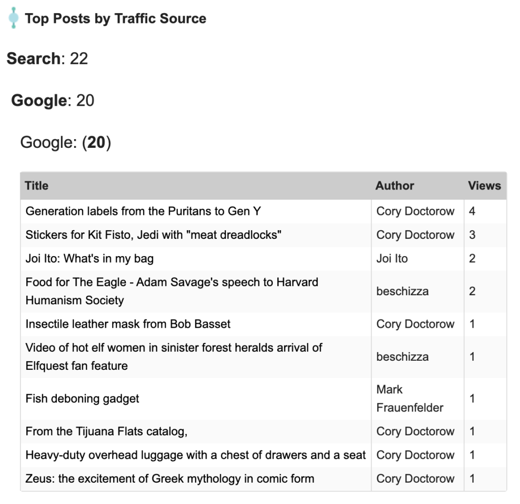
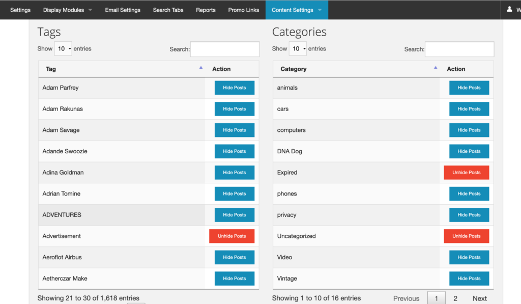
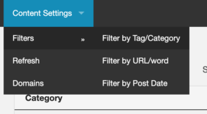
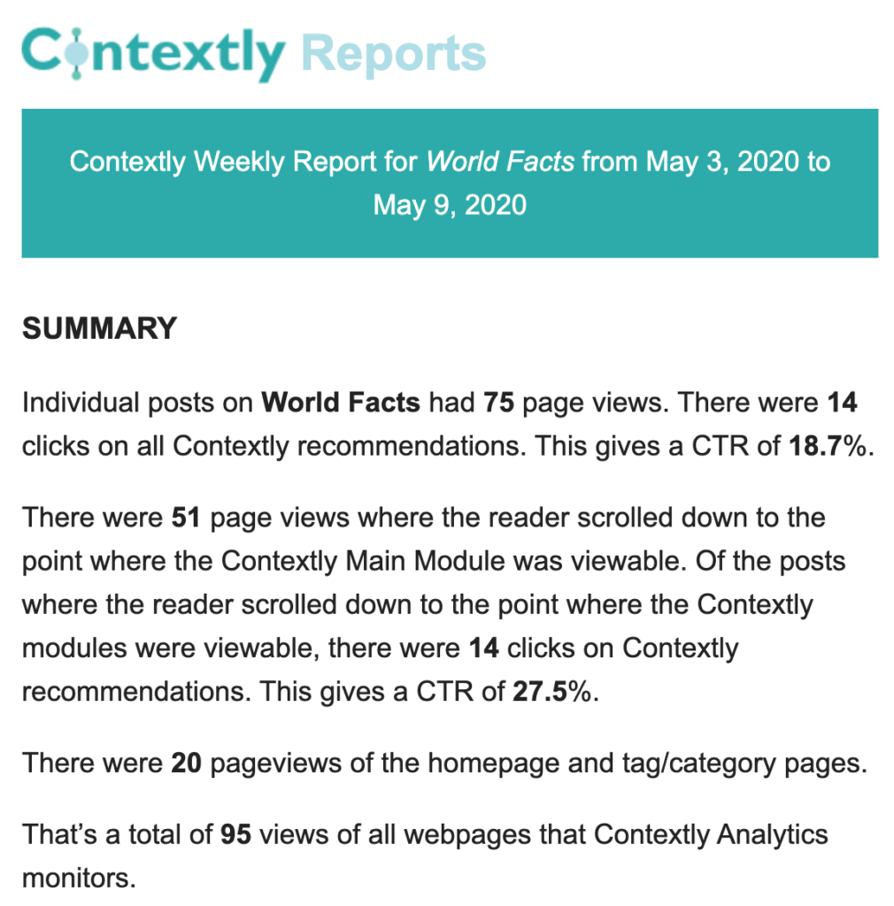 And, in a longer breakdown,
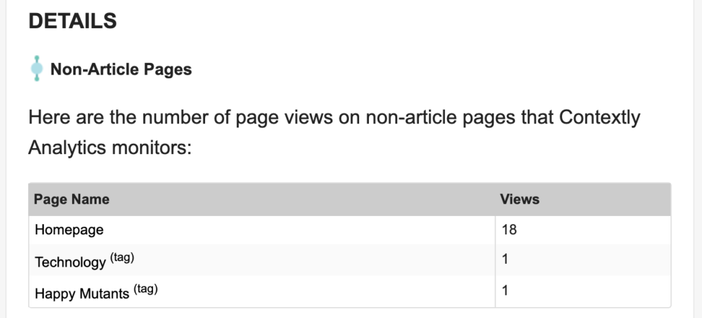


 When I quit my editing job at Wired in 2012 to spend more time with my startup,